Okay, so I’ve realized I have to bite the bullet and learn to do some graphics stuff or else be dependent on other people, which is irritating. So here’s an attempt at a postcard advertising my classes, which I thought I’d use at cons to promote them. I know this is lame, but suggestions are very welcome. First up is a different font, I think.
Is the whole graphic the post card, with the cat image in the background? Don’t feel you need to lose valuable space for your words by scrunching them together in the corner. Give them a little room. One tip is to keep your sentences short and sharp, something a person can digest in a glance. I’d suggest your opening line read: Take your writing to the next level! Fewer words, and a sharp declarative.
I like that Courier-type font. But I am no designer.
Fwiw, a friend has used GIMP to design his own covers for four of his books; he says that once he got used to the interface it was a pretty powerful program. (I assume from the title of your post that you’re playing around in GIMP.)
Just my few thoughts. And of course, like literary criticism, this is all IMHO, and use or don’t. I could be full of crap. It’s been known to happen before.
Nice photo selection and the weighting on the lower right feels pretty good for asymmetry. I agree, you want a nicer looking font. If you’re just doing this as an online ad, you have a lot of choices for fonts meant to be read on the screen, although with higher resolutions that starts to be mitigated and you can have a wider range.
Use higher resolution unless this is meant to be 640×480 (which will only work as an online ad).
You might want to rethink the crop of the image. Show more of the eyes at the top of the cat glass bulb, right now there’s just a sliver, not enough to give us the “it’s looking at me” feeling, and not cropped off. It feels like a mistake instead of being on purpose.
I would suggest rewrite second paragraph to continue focus of first sentence. “Be launched to new heights of productivity as Cat Rambo’s online classes teach you”¦” or some such. While the focus of the sentence is still the reader, burring them six words in defuses the hook. Also, make the ad about them. Sure, it’s for your classes, but as David Ogilvy (I think) said, “I could make an full page ad in the NYTs that was only text. The first line would read, ‘This ad is all about you”¦’ and you would read the entire ad.”
Try ghosting a white box over the background instead of a solid blue box. The white will need to desaturate, and push the tones of the photo toward the lighter end of the spectrum to make the text as readable as possible. the box also feels a little large, it’s too close to the center, but not on it. Think of proportions of 2 to 3 or 3 to 5 for a more pleasing arrangement (this small, I would go with visual proportion instead of by the numbers).
You don’t need the “http://”, at this time most kids get that part, and very few of us old timer ever type it in anyway. The “www.” is enough for people to get it’s a website (actually, the “.com” is all that’s needed, but some people’s configurations differ). That will help the text look a little cleaner.
Finally, with the line breaks it feels to me like you’re shaping the text (the ragged right makes a nice over all curve if you average out the ends). And both paragraphs end with one word on the last line. Try to avoid that.
I like the design, but I’m iffy on courier, but anything other than Comic Sans is probably a win. I have played with GIMP a bit now and like it, though I do prefer InDesign and Photoshop which I used regularly back when the fed paid me to design
As irritating as I know it is to depend on other people, I’ve learned that sometimes it’s better to use my time on my strengths, rather than trying to learn something that other people have already mastered. I mean, if you truly want to learn graphic design, that’s one thing. But if you would rather be spending your time on writing, editing, and teaching, then it might be wiser to delegate the task out, rather than learning the idiosyncrasies of GIMP and the rules of graphic design. Perhaps you could trade postcard design for a story crit or something? I’d be happy to help you out, as would, I’m sure, many other talented graphics people in the SF-writing world. (Not to say that your postcard attempts so far are horrible–they’re fine and should suffice for your purposes. Just that, as a visual arts person, I do see a bunch of things that could be improved to help make them better. As an editor, you know how it is…) OTOH, if you want to learn because you want to learn, then I’m happy to give you tips.
I think that’s true, and for something important, I’d spring to hire someone. But I’d like to be able to throw together prototypes, at the least, I like messing around with graphics, and sometimes when one is a habitual procrastinator, it’s good to know these things. 😉
Want access to a lively community of writers and readers, free writing classes, co-working sessions, special speakers, weekly writing games, random pictures and MORE for as little as $2? Check out Cat’s Patreon campaign.
Want to get some new fiction? Support my Patreon campaign.
"(On the writing F&SF workshop) Wanted to crow and say thanks: the first story I wrote after taking your class was my very first sale. Coincidence? nah….thanks so much."
~K. Richardson
You may also like...
Cussin' in Secondary Worlds
Cussin’ in Secondary Worlds
Saturday, June 10, 9:30-11:30 AM Pacific Time
Cursewords, expletives, and more – those things your characters say when nothing else will do – tells you more about the world (including issues of class, cultural taboos, and more) than you might imagine. How cussing and worldbuilding interrelate. AKA the class where we say F*ck a lot.
Join Norton Award winning author Fran Wilde, author of Updraft, Cloudbound, and The Jewel and Her Lapidary for a workshop that will leave you ready to swear magnificently.
Classes are taught online via Google hangouts and require reliable Internet connection, although in the past participants have logged on from coffee shops, cafes, and even an airplane; a webcam is suggested but not required.
To register for this class, mail me with the following details:
The email address associated with your Google account
Which class or classes and the dates
Remind me if you have already taken a class with me so you can get the former student rate ($79). Otherwise the cost is $99.
Whether you would prefer to pay via Paypal, check, or some other means.
Upon receiving that, I will send you an invoice.
Important! Remember every class has at least one Plunkett scholarship for students who could not otherwise afford the cost. To apply for a Plunkett, mail me and tell me why you want to take the class in 100 words or less.
The human associated with this fine dragon is Goldeen Ogawa (http://www.goldeenogawa.com/).This Sunday, Folly Blaine and I are teaching another podcasting class. Here’s the description:
Podcasting Basics
Podcasts, both audio and video, are an increasingly popular way to reach an audience. In this two hour session, learn what you need to know to record and edit your own podcast, how to promote your podcast, and what equipment and software to use. As Folly Blaine, Christy records and acts as Podcast Manager for Every Day Fiction, and has also recorded podcasts for Beneath Ceaseless Skies, Wily Writers, and This Mutant Life; Cat is the former fiction editor of Fantasy Magazine and has recorded podcasts for Clarkesworld, Beneath Ceaseless Skies, and Fantasy Magazine. Limited enrollment ““ reserve a slot now!
Sunday, 9:30-11:30 AM PST, February 9
$99
Why might you be interested in podcasting and learning to do your own? Here’s a few reasons:
It’s a good way to reach a new set of readers. Many of the people who listen to podcasts prefer that to finding your stuff in text form inline. They’ll listen to your story in the car, while exercising, while working, and other places where text isn’t convenient. And they’re always looking for new, good stuff.
It’s a great way to polish your reading aloud skills. As a writer you’ll need to do readings. We’ll give you some tips in the class, but the best way to get better at it? Practice.
It makes you comprehend your work in a new way. I always read aloud stories as a last step in polishing them. Combine that with recording a podcast and you’re examining your work in order to figure out how it sounds.
Last week, my agent told me that authors who record their own books see a significant bump in sales, but that publishing houses don’t like to have them do it, because they’re unsure of the quality. If you can point to previous podcasting experience, you can back up the suggestion that you read your own work and even have samples of what you can do.
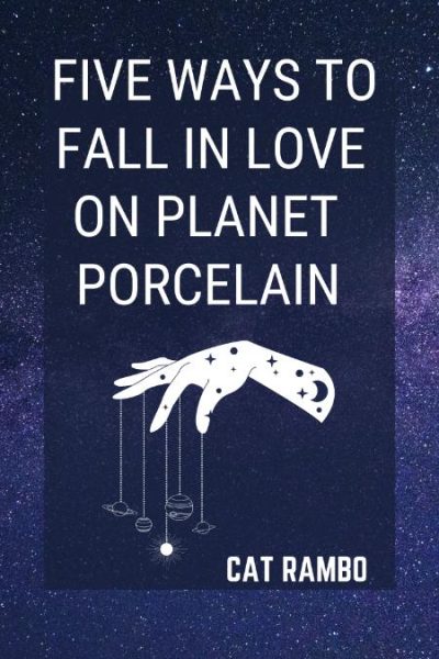
When publicizing “Five Ways to Fall in Love on Planet Porcelain,” I made sure it was available in audio form. Did that help earn it a Nebula nomination? I don’t know, but it certainly didn’t hurt.
Prefer to opt for weekly interaction, advice, opportunities to ask questions, and access to the Chez Rambo Discord community and critique group? Check out Cat’s Patreon. Or sample her writing here.


 Cussin’ in Secondary Worlds
6 Responses
Is the whole graphic the post card, with the cat image in the background? Don’t feel you need to lose valuable space for your words by scrunching them together in the corner. Give them a little room. One tip is to keep your sentences short and sharp, something a person can digest in a glance. I’d suggest your opening line read: Take your writing to the next level! Fewer words, and a sharp declarative.
I like that Courier-type font. But I am no designer.
Fwiw, a friend has used GIMP to design his own covers for four of his books; he says that once he got used to the interface it was a pretty powerful program. (I assume from the title of your post that you’re playing around in GIMP.)
Just my few thoughts. And of course, like literary criticism, this is all IMHO, and use or don’t. I could be full of crap. It’s been known to happen before.
Nice photo selection and the weighting on the lower right feels pretty good for asymmetry. I agree, you want a nicer looking font. If you’re just doing this as an online ad, you have a lot of choices for fonts meant to be read on the screen, although with higher resolutions that starts to be mitigated and you can have a wider range.
Use higher resolution unless this is meant to be 640×480 (which will only work as an online ad).
You might want to rethink the crop of the image. Show more of the eyes at the top of the cat glass bulb, right now there’s just a sliver, not enough to give us the “it’s looking at me” feeling, and not cropped off. It feels like a mistake instead of being on purpose.
I would suggest rewrite second paragraph to continue focus of first sentence. “Be launched to new heights of productivity as Cat Rambo’s online classes teach you”¦” or some such. While the focus of the sentence is still the reader, burring them six words in defuses the hook. Also, make the ad about them. Sure, it’s for your classes, but as David Ogilvy (I think) said, “I could make an full page ad in the NYTs that was only text. The first line would read, ‘This ad is all about you”¦’ and you would read the entire ad.”
Try ghosting a white box over the background instead of a solid blue box. The white will need to desaturate, and push the tones of the photo toward the lighter end of the spectrum to make the text as readable as possible. the box also feels a little large, it’s too close to the center, but not on it. Think of proportions of 2 to 3 or 3 to 5 for a more pleasing arrangement (this small, I would go with visual proportion instead of by the numbers).
You don’t need the “http://”, at this time most kids get that part, and very few of us old timer ever type it in anyway. The “www.” is enough for people to get it’s a website (actually, the “.com” is all that’s needed, but some people’s configurations differ). That will help the text look a little cleaner.
Finally, with the line breaks it feels to me like you’re shaping the text (the ragged right makes a nice over all curve if you average out the ends). And both paragraphs end with one word on the last line. Try to avoid that.
Hope that all helps.
I like the design, but I’m iffy on courier, but anything other than Comic Sans is probably a win. I have played with GIMP a bit now and like it, though I do prefer InDesign and Photoshop which I used regularly back when the fed paid me to design
As irritating as I know it is to depend on other people, I’ve learned that sometimes it’s better to use my time on my strengths, rather than trying to learn something that other people have already mastered. I mean, if you truly want to learn graphic design, that’s one thing. But if you would rather be spending your time on writing, editing, and teaching, then it might be wiser to delegate the task out, rather than learning the idiosyncrasies of GIMP and the rules of graphic design. Perhaps you could trade postcard design for a story crit or something? I’d be happy to help you out, as would, I’m sure, many other talented graphics people in the SF-writing world. (Not to say that your postcard attempts so far are horrible–they’re fine and should suffice for your purposes. Just that, as a visual arts person, I do see a bunch of things that could be improved to help make them better. As an editor, you know how it is…) OTOH, if you want to learn because you want to learn, then I’m happy to give you tips.
I think that’s true, and for something important, I’d spring to hire someone. But I’d like to be able to throw together prototypes, at the least, I like messing around with graphics, and sometimes when one is a habitual procrastinator, it’s good to know these things. 😉