
Day Four of the giveaway and row four of the art! This week has seen some nice press for the book, including a nice Tor.com review by Stephen Raets. If you’re looking for other places to possibly score a piece of the jewelry, try David Steffen’s blog, Far Beyond Reality, or the Goodreads giveaway for Near + Far. As always, comment here to be entered in this particular giveaway!
Image #1 appears on both the title page of Far and the story “Five Ways to Fall in Love On Planet Porcelain.” Christmas tree, one-eyed triffid, and rocket ship all in one.
Image #2 accompanies the flash piece, “Space Elevator Music”. I picked it for its upward line, which made me think of a rising elevator.
Image #3 is a favorite of mine because it always makes me think of the submarine in Yellow Submarine. I picked it to go with a story that’s light and funny and silly accordingly, “Zeppelin Follies.”
Image #4 is a lovely piece that, if I look long enough, becomes a woman wearing an elaborate headdress. As always, your mileage may vary there. It goes with the story, “A Querulous Flute of Bone,” which appeared in the anthology TALES FROM THE FATHOMLESS ABYSS and features the philosopher-king Nackle.
Image #5 actually doesn’t seem to appear in my copy of the book, but it’s a proof, so things may have changed somewhere along the line. Bonus!
...

I had to go hunt for my proof copy of the book in order to be able to look up the art this time. Tod snagged all my extras in preparation for the reading this Friday, at the University Bookstore in Seattle, at 7 pm. I’ll be reading with three terrific writers: Alma Alexander, Corry L. Lee, and Roz Kaveny.
So! Here’s day three of the giveaway. Comment to win!
(left to right)
Image #1 goes with the story “Therapy Buddha,” which is about how much we project things onto objects and coincidences. It’s near future, another one of the eyed creatures, this one peering down, a little inquisitively, a little confusedly. It looks like part of an organic machine, like so many of Mark’s images.
Image #2 accompanies the story, “Close Your Eyes,” which originally appeared in Apex Digest. This is the one I have as a tattoo, from back before I moved to Seattle, given to me one night in a Durham tattoo parlor. I like it for its ability to be wing and eye and fish, all in one. Vicki used it with the Table of Contents as well.
Image #3 looks like a rocket ship and a Greek amphora at the same time, perhaps bubbling over with some sort of pine and summer scented wine. I selected it to go with “Peaches of Immortality” because it seemed to me it looked a little like the machine at the end of the story.
Image #4 is a detail of the larger image that goes with “The Mermaids Singing, Each to Each.” I’m glad Mark pulled it out like this for the jewelry, since it makes a lovely little piece. His work often has a tribal feel to it, and this looks like an orca to me.
Image #5 goes with “Legends of the Gone”. Sometimes Mark repeats images and this is a variant of one that I always see as a large flightless bird, standing looking at the viewer. (You may not see it. That’s okay.)
...

This week sees the book getting officially launched on Wednesday. This week I’ll be doing a series of five posts about the interior art. Comment on a post to be entered to win one of three pieces of Near + Far jewelry; comment on all five posts and you’ll be entered five times.
Here’s the second row of pieces. I was talking to someone last night about why it made me so happy to use Mark’s art: he’s been showing it to me for close to two decades and I’ve always wanted to use it to illustrate something.
So, left to right: Image #1, which has a funky little seahorse feel. When looking at Mark’s pieces, I tended to use the older stuff for “Near” stories and newer for “Far”. This one went with VocoBox ™, an early story about what would happen if cats could talk. (And I think it’s fairly accurate in that regard.) My cat is named Raven, much like the cat in the story, and this is my way of preserving him, because he’s been a great cat. 🙂
Image #2 has a sparse feel to it, and there’s one of those funky little eyes peering out at you. It accompanies the story “Not Waving, Drowning” (a title shamelessly taken from Stevie Smith, because it’s so terrific), which is about the harder side of telepathy, which always seemed to me like a terrible, terrifying superpower.
Image #3 is another earlier one, and it makes me think of the idea of spaceships as living things. It accompanies RealFur, a story about the relationship between people and objects, a theme which gets explored in “Therapy Buddha” as well.
Image #4 accompanies a story that appeared in Talebones, “Memories of Moments, Bright As Falling Stars”. It’s a cypberpunk-influenced story, and one I like a lot for its grungy and sometimes eccentric world.
Image #5 also accompanies a story influenced by the cyberpunk movment, “10 New Metaphors for Cyberspace.” It’s a flash piece, or perhaps a prose poem, depending on your definition, trying to think about how we might have seen cyberspace if Gibson hadn’t shaped it so definitively.
If I picked a favorite from this batch, it would be either #2 or #5. We still haven’t seen the one that I have as a tattoo yet, or the one that I’m thinking about for a new tattoo. 😉
...

This week sees the book getting officially launched on Wednesday. This week I’ll be doing a series of five posts about the interior art. Comment on a post to be entered to win one of three pieces of Near + Far jewelry; comment on all five posts and you’ll be entered five times.
So left to right above are five of the interior illustrations from the book. One of the things Mom said to me last night was how much she was enjoying the afternotes, so I’m trying not to repeat those too much, but to add a touch more to them.
Leftmost is a star like pattern, which accompanies far future story “Timesnip,” in which 18th century Victoria Woodhull copes with life in the future as a traveling saleswoman dealing in time travel. It’s actually a version of one of the other illustrations, arranged in a star cluster, which mark didn’t point out to me till later. That seems very fitting, given the circularity of the story.
The second pattern is one that accompanies the story “Amid the Words of War.” Its cramped interior echoed the desperation on Six’s part that I wanted to convey over the course of the story. The story is about war and conflict and the distrust they force on each other. The pieces in the book are black and white and here Mark’s chosen to create a white “eye” for a number of the illustrations which (to me) just adds to the coolness and makes each one become a creature presenting itself sideways to the camera.
The third design accompanies the story “Kallakak’s Cousins”. Again, there’s that eye looking out, and sometimes it’s a creature and sometimes a face, sometimes a helmet built of butterflies and submarines.
The fourth accompanies a flash piece, “Futures.” It resembles a submarine, or perhaps a rocket ship, although once more there’s an eye, set dead center in this case.
The fifth is used with the slipstream afterlife story, “Bus Ride to Mars.” It’s one of Mark’s older pieces, a sideways slash of a piece that appears differently in here than in the book itself.
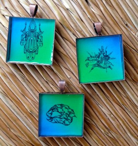
...

The party at WorldCon was so! great! And it helps to have such a nifty book to show off. So I wanted to enthuse a bit more about it and why I’m so happy with it.
...
If you’d like to preorder Near + Far from Hydra House, you can do so here. We will have some copies with us at WorldCon. If you’re there and around Saturday night, please stop by our Pink + Blue party, up on the 32nd floor.
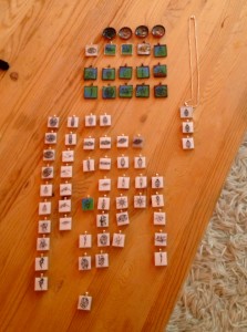
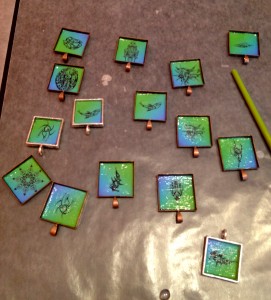
I’ve been working on the jewelry, which got pretty much finished up today. We’ll be giving away 30-35 of those at the party, plus books, stickers, CDs, and handmade journals.
Here’s a bunch of the pieces laid out:
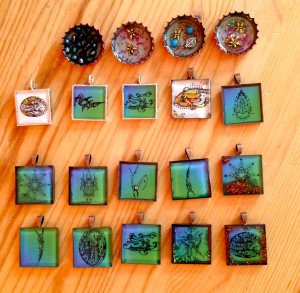
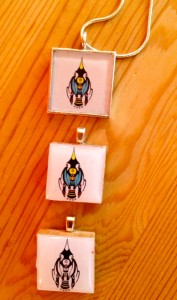
And here’s closeups of some of the same image. One thing is for sure — each of these is unique!
I’m working on a piece for the SFWA Blog about promotional giveaways. What are the best — and worst — ones you’ve seen? What resources would you recommend to people? The stickers are the interior art, done in a nice size that’s big enough not to lose but small enough to be able to use in a number of places.
One of the things that’s emerged from the discussion so far is to use things that people will use and keep on using, whether it’s bookmarks, pens, notebooks or a host of other clever items. The fans Mary Robinette Kowal has been giving away with Glamour in Glass were mentioned several times, and I know I thought of her cleverness with temporary tattoos to address an issue with the first edition.
...
Want access to a lively community of writers and readers, free writing classes, co-working sessions, special speakers, weekly writing games, random pictures and MORE for as little as $2? Check out Cat’s Patreon campaign.

"(On the writing F&SF workshop) Wanted to crow and say thanks: the first story I wrote after taking your class was my very first sale. Coincidence? nah….thanks so much."